An instructor’s favorite student activities from Teaching Statistics

There are few books that provide practical lesson plans and activities to use in statistics courses at the university level. Teaching Statistics: A Bag of Tricks is one of them.
Written by Andrew Gelman and Deborah Nolan, I first learned about the book immediately after the second edition was published in 2017. I had been through a few iterations of my course NR 5021: Statistics for Agricultural and Natural Resources Professionals at the University of Minnesota. Iwas looking for some new ideas to present challenging subjects related to statistics and data analysis.
The book is an excellent reference for anyone teaching concepts related to statistics and data science. It moves from discussing how to engage students in learning concepts related to probability and statistics, the logistics and structure of a semester-long course, and how to present more advanced statistical topics such as survey sampling and Bayesian statistics.
But what I’ve found most valuable about Teaching Statistics is the nugget-sized activities that an instructor can set up for their students. These activities typically only take 10 minutes during a synchronous class and they are excellent ways to break up extended periods of lecture or discussion within a class.
Here are three activities I’ve used more than once with great success in teaching introductory concepts related to statistics and data analysis.
Sketching a best-fit line

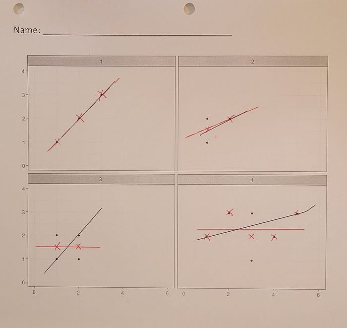
Found on page 49 in the second edition, this activity asks students to sketch a best fit line on a series of simple scatter plots. The instructions are simple: to draw a line between the points to create a best fit line. Students then calculate the value of the difference between each data point and their best-fit line.
The second part of the activity asks students to place an “X” at the average y-value for each x-value. Then students draw a best-fit line through the “X” marks on their graphs. After calculating residuals with this new line, students quickly realize the differences between both sets of lines.
When students complete this activity individually, they come up with different slopes on the scatter plots compared to their classmates. Without discussing any definitions, this short graphical exercise allows the instructor to gently ease into discussing concepts of least squares regression.
Correlation between hand span and height

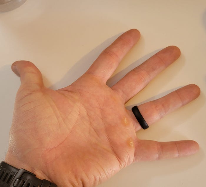
This activity requires students to collect measurements of their hand span, the distance between one’s thumb and pinkie finger when the hand is spread apart (page 53–54). Students then create a scatter plot with this variable and their height.
Students quickly see the positive correlation between the two variables: taller people typically have longer hand spans. Students share their measurements with the class and data can be entered into software for analysis. As an instructor, you can also compare your class data with that of a data set popularized by Karl Pearson. (Hint: students are taller now than in Peason’s time of the early 1900’s.)
I ran this activity once in a class of about 25 students and was surprised to find a correlation coefficient of only 0.23. I asked students why they thought we observed this result and one eager young man responded “It’s because I’m tall but have small hands!” The activity resonated with students by connecting the weak correlation we observed with the physical traits of a student they could see in the flesh.
Confidence intervals and water on Earth
One of my favorite activities from the book is an exercise where students determine the proportion of Earth covered in water (p. 138–139). This activity involves students picking a random set of coordinates for a location on the planet’s surface. If your class meets in person you can toss a beach ball of Earth around the room. If your course is online you can use a web-based tool like the Random Geographic Coordinates webpage.
Students record whether a random coordinate falls on land or water. If you’re in person, tell students to toss the ball to a classmate and record whether the classmate’s right index finger lands on water or land. Students repeat this so that they have 20 random locations and whether they are on land or water.
Ask students to determine the proportion of earth covered with water from their collection of random samples. Approximately 71% of the Earth’s surface is truly covered with water, a value you can tell students to research and compare with their own calculated proportion.
The data can be used further to reinforce concepts related to confidence intervals. Here is a problem set I ask students to complete with their data:
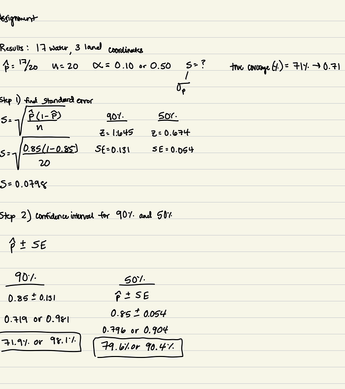
Calculate two sets of confidence intervals for your estimates — one at the 90% level and one at the 50% level. After performing those calculations, do an internet search to find out the true proportion of earth covered in water. Do both of your confidence intervals contain the value for the true proportion of water? Write two-three sentences describing how the width of the confidence intervals will influence whether or not the true proportion of water is found within your confidence interval.
Here is an example student’s calculation:

Drawing on the power of students collecting and summarizing their own data, this is an effective activity that engages students in interpreting confidence intervals.
Add Teaching Statistics to your toolbox
I recommend Gelman and Nolan’s book to anyone that is tasked with conveying topics related to statistics and data analysis with others. As I have written, many of these activities transition well to a virtual and asynchronous class format, with some slight adjustments needed.
There are decades worth of teaching examples and pedagogical practices found in Teaching Statistics. Insights from the book can help you plan effective courses, workshops, and lessons related to data and statistics.
